PH3D Dashboards Project Website
Overview
As a Research Assistant (Now Project Coordinator), I was tasked with keeping the project website for the Public Health Data Dashboards project updated. This website is the face of the project and the referential point for any questions about it. This redesign consisted of a two phase process. One initial redesign, and later a second one when the website direction was updated in order to focus on a more community centric site.
-
Ongoing, continued website management
-
Analysis
Wireframes
WordPress updates
-
Figma
Phase 1: UX Analysis
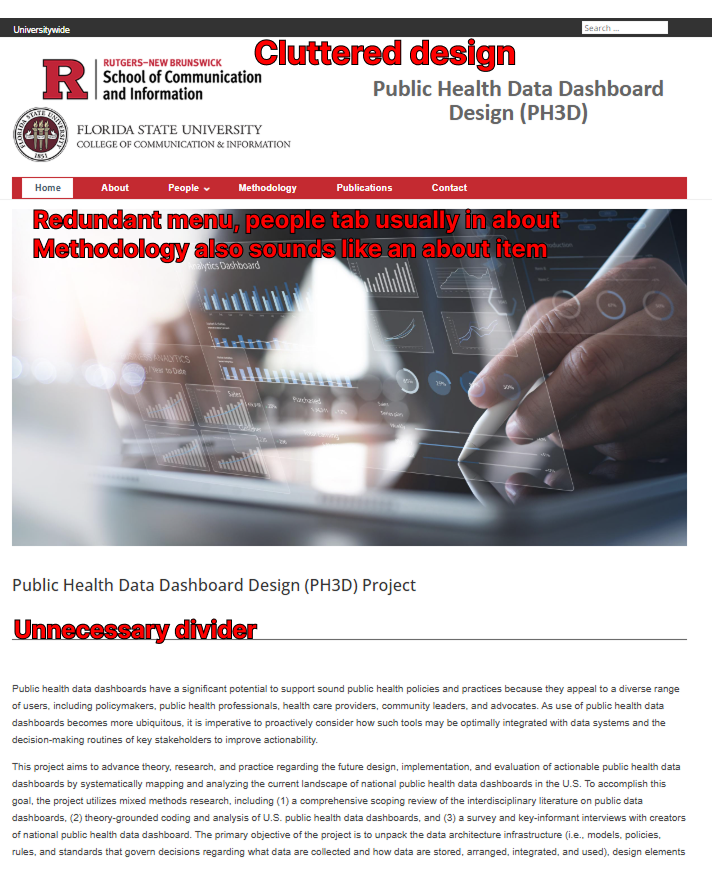
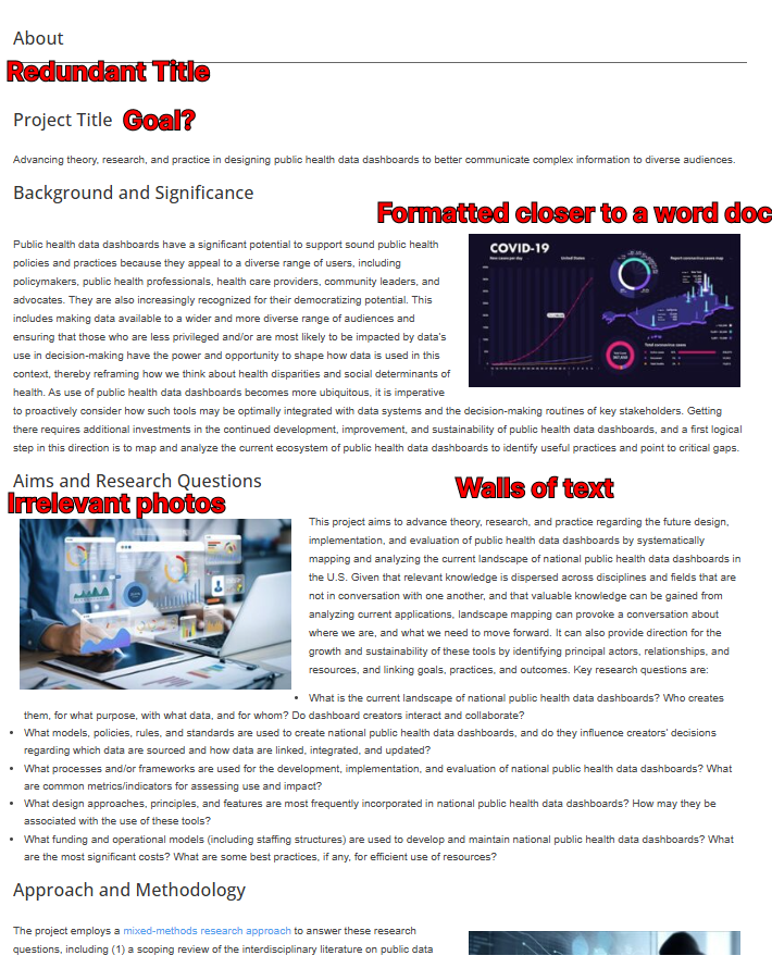
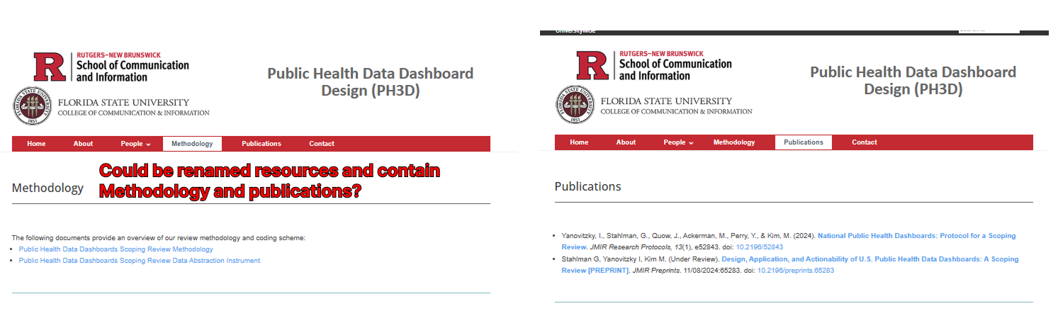
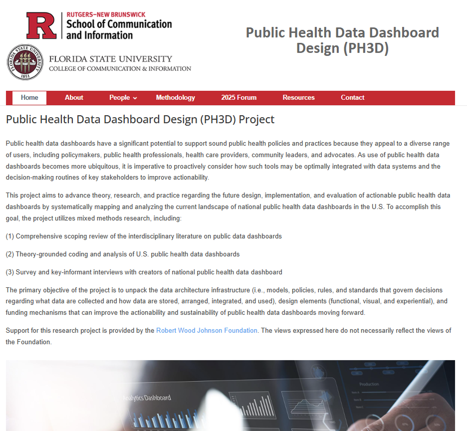
To start out with, I went through the website and noted potential pain points that would need to be redesigned. These included a variety of areas that needed to factor readability and accessibility. The site was not friendly to visitors due to being excessively wordy. Some of the majors areas I needed to focus on were:
-UX Writing: Rewording the website
-Restructuring to a more universal format (Some elements resembled more of a document than a website)
-Navigation was redundant and unclear
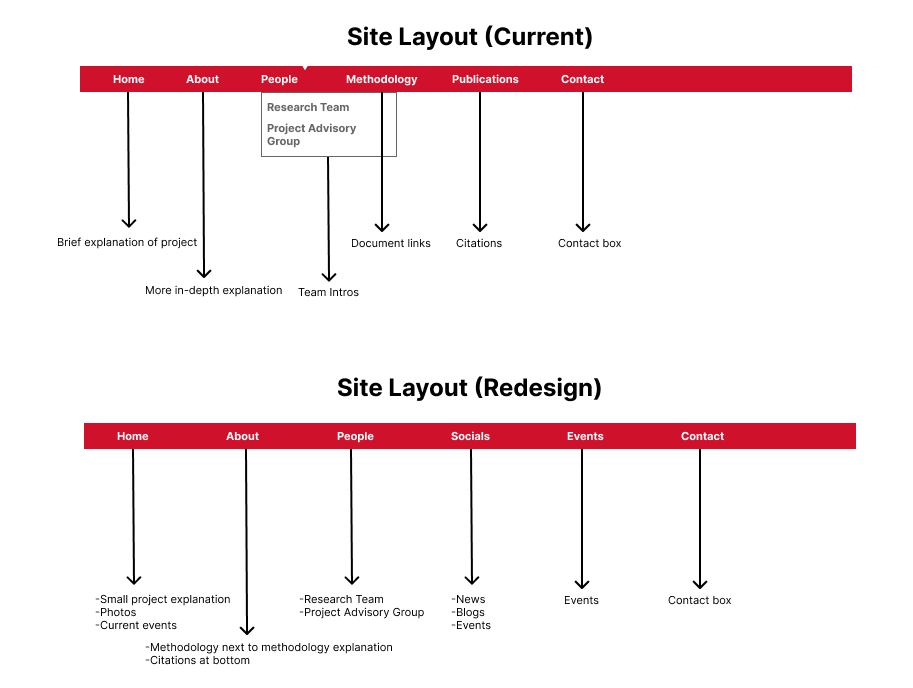
Information Architecture
Seeing the prior situation in regards to the menu. I put my Information Architecture class experience to redesigning the site layout. An expansion of the website was planned so I added additional elements that fit a better universal idea of what to expect from a project website.
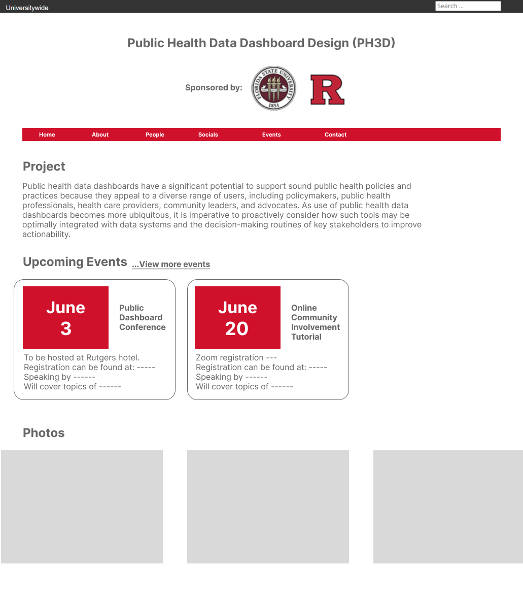
Figma Redesigns
Through Figma, I planned out the overall look and feel of the website to be able to consult the team on the direction that we wanted to head into. This redesign focused on compiling the present website into a more accessible and general format.
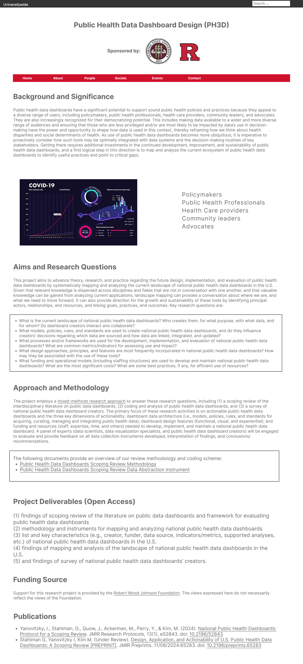
Wordpress Site Update
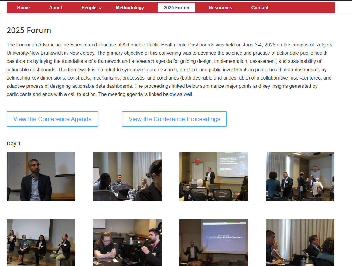
Although I am used to Figma, which enables me to customize each elements to my liking as a designer, to work on the main website, I needed to utilize an older WordPress instance in order to redesign the project website. There are many constraints in place and I needed to work around them to deliver the best user experience within my means, even if it meant that I could not rely on my original designs anymore.
Phase 2: Research
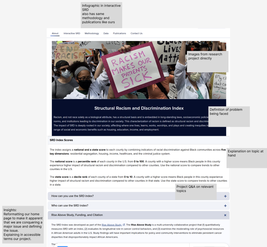
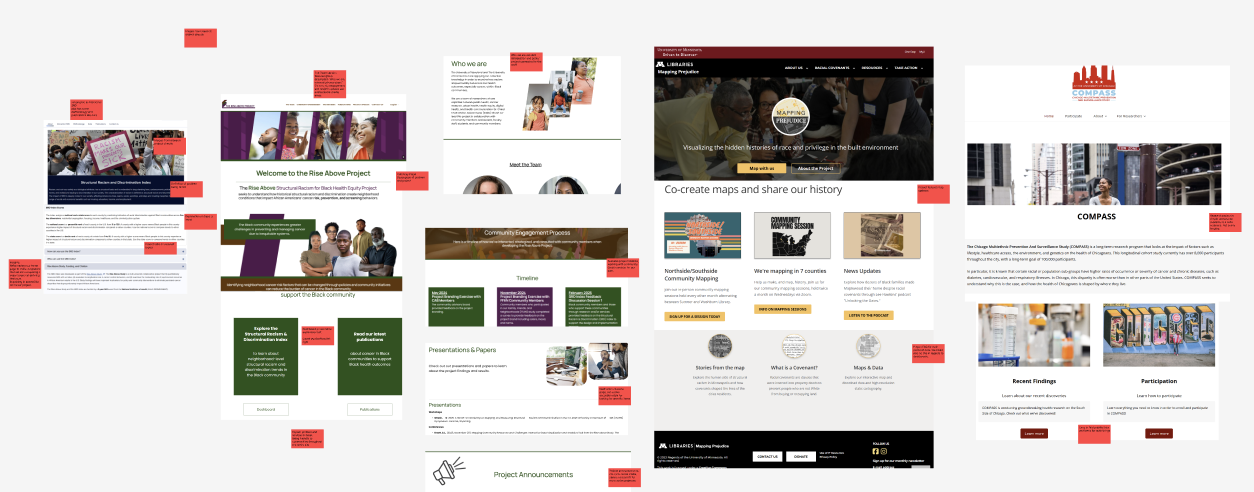
At a later stage, we revisited our site along with a collection of other similar project websites. I was tasked with the goal of aligning our site identity to feel more community oriented. To kick this off, I analyzed project websites that had a community feeling to them to brainstorm what could be improved upon our personal site. Some fixes had already been implemented such as changing the text to be easier to read and more accessible to visitors. A few ideas that would enable a community oriented site are as follows:
-A frequently asked questions segment would allow visitors to understand the exact impact of the project
-A clearer problem statement that we are trying to solve and what effects it is having on people. Showing an easier to understand cause and effect situation.
-A socially connected feeling through social media, blogs, and images. Showcasing our direct actions involving communities and collaboration.
Final Website Update
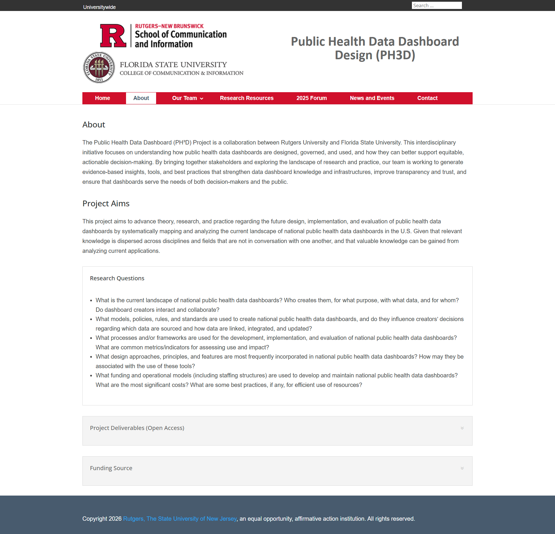
These changes within phase 2 were designed and then implemented within the WordPress site. I made the site more approachable by reducing the amount of text that can overwhelm visitors. I gave control back to the visitor by relocating text into expandable boxes that are up to the visitor’s needs of whether they should be accessed or not. Other subtle changes also make a big difference in how friendly a site feels. Instead of a menu tab saying “People”, one that says “Our Team” shows our cohesive situation. Additionally, our methodologies and information can be summed up in “Research Resources” which allows visitors from other Project Teams to be able to understand and study our methods. Lastly, the News and Events sections was finally completed, allowing our impact to be more visible and understandable.
The current iteration of our site can be visited here: https://ph3d.rutgers.edu/